Client brief
Name
Celtic Hops
Established
2023
Location
Scotland
Category
Logo design
Industry focus
Beverage
Celtic Hops is a craft beer brewery rooted in the rich cultural heritage of the Celtic lands. Their commitment to quality, authenticity, innovation, and community sets them apart in the craft beer industry. Targeting beer enthusiasts who appreciate quality and authenticity, they offer a diverse range of brews that honor tradition while embracing creativity. Their logo project seeks to enhance their brand identity, recognition, and credibility, resonating with their spirited and adventurous brand personality. Their design preferences includes a hops in the logo, for which is part of their comapny name, a logo that is suitable for various platforms.
Mood Board

Core Concept
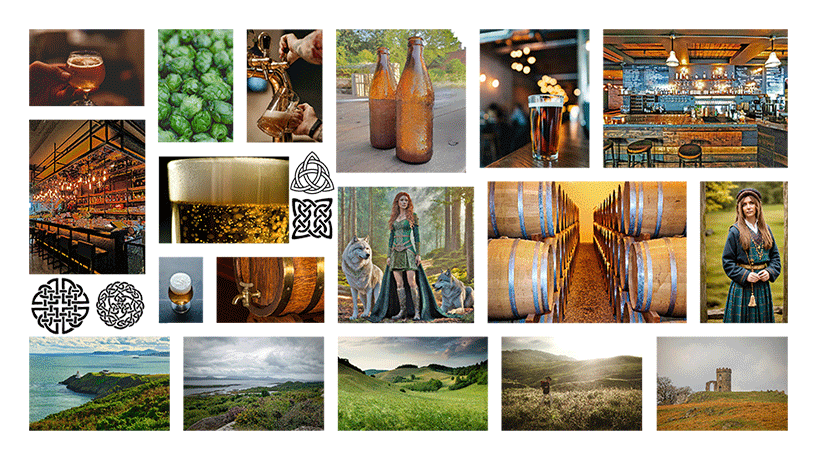
The mood board draws inspiration from Celtic heritage, incorporating intricate patterns and symbols that evoke a sense of tradition and craftsmanship. These elements set the tone for the beer company, reflecting their dedication to quality and authenticity, while inviting customers to immerse themselves in the rich flavors and stories behind each brew.
Colour Palette
The palette mirrors the rugged beauty of Scotland’s landscape and the vibrant spirit of Celtic tradition. Green, brown, and yellow echo the lush forests, ancient hills, and golden fields, while touches of orange and black add depth and mystery. White provides a clean backdrop, symbolizing purity and clarity.
Imagery
The visuals blend scenes of brewing craftsmanship with the rugged beauty of Scottish landscapes. Beer bottles, glasses, and wooden kegs evoke the essence of their brews, while images of bars and Celtic costumes add a touch of tradition. Hops and forests connect them to their natural ingredients and homeland, while Celtic drawings infuse mystique.
Texture
The textures blend rustic authenticity with refined elegance, capturing the essence of Celtic Hops. Wooden surfaces evoke tradition, while glass elements add sophistication. Images of Scottish landscapes introduce organic textures, while Celtic drawings infuse cultural depth.
Logo creation

The logo’s typography is crafted with attention to proportions and unity. Each letter is designed to ensure balance and readability, seamlessly integrating with the intricate hops design. This unified blend of text and symbol enhances the visual appeal, reflecting the dedication to quality and craftsmanship in every aspect of Celtic Hops.

The logo, showcasing two hops entwined, symbolizes the harmonious fusion of tradition and innovation at Celtic Hops. This intertwining of elements embodies their commitment to crafting beers that honor heritage while embracing modern brewing techniques. Beneath this symbol, the accompanying text represents their dedication to quality and flavor excellence. Together, the hops and text create a distinctive emblem that embodies the spirit of Celtic Hops and invites drinkers to discover the balanced blend of their brews.
Color variation

The carefully chosen color palette is a key driver in attracting customers and shaping their brand identity. Vibrant shades of green, orange, and yellow evoke energy and excitement, enticing customers to engage with their brand. Meanwhile, blue-gray and sea blue hues convey authenticity and reliability, reflecting the serene landscapes of Scotland where their brewing journey begins. Touches of blue, white, and black add sophistication and clarity, instilling confidence in their products and reinforcing their commitment to quality. Together, these colors create a compelling brand image that resonates with their audience, setting them apart in the competitive beer market.
Mockups


